Earle Consulting – Branding
Earle Consulting
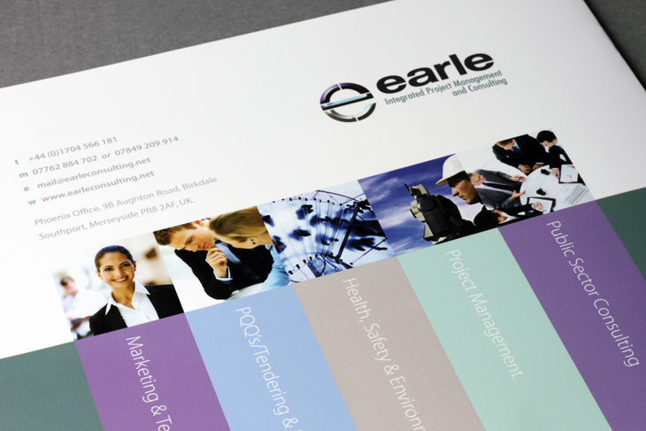
Earle Consulting came us to rebrand, as their old identity was old fashioned (a pen and ink illustration of Stonehenge). Not at all representative of a company with a very forward looking vision.
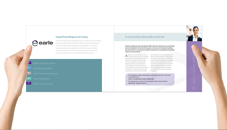
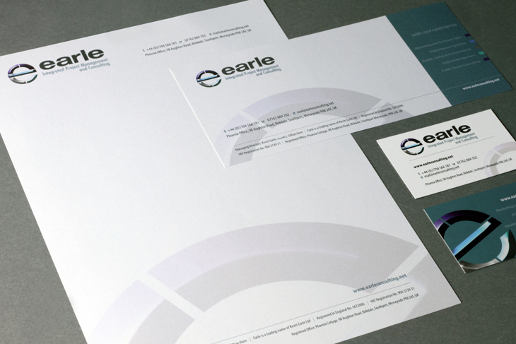
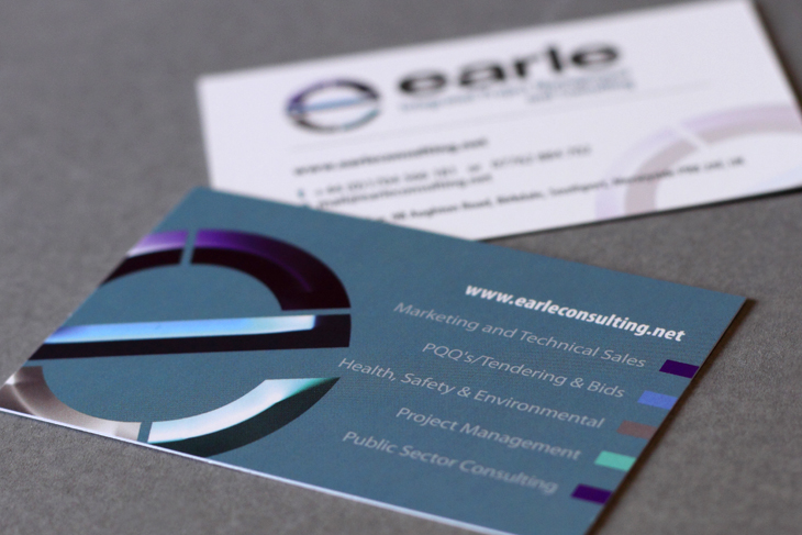
Their new branding rationalises the name, now known as Earle, sectionalised the business, which is now represented in the colour coded ‘e’ of their new logo and presented as a much more modern and dynamic organisation.
We also produced a corporate video for them to help their Google Rankings. See the title sequence here.
View moreFor more information on branding, brochure design or video for your business:


